Overview
This dashboard provides reporting of your direct mail efforts. This includes KPIs, incremental analysis, and top-performing initiatives.
The dashboard will appear for PostPilot customers who meet the following criteria:
- On Shopify
- Have at least 3 “sent” or “active” campaigns
- Generated at least $100 across those campaigns
Main Dashboard View:
The initial dashboard view features a personalized welcome (name and brand hidden in the screenshot below), a KPI overview by campaign type, an account manager tile, holiday mailing opportunities, as well as top performing campaigns and creatives.
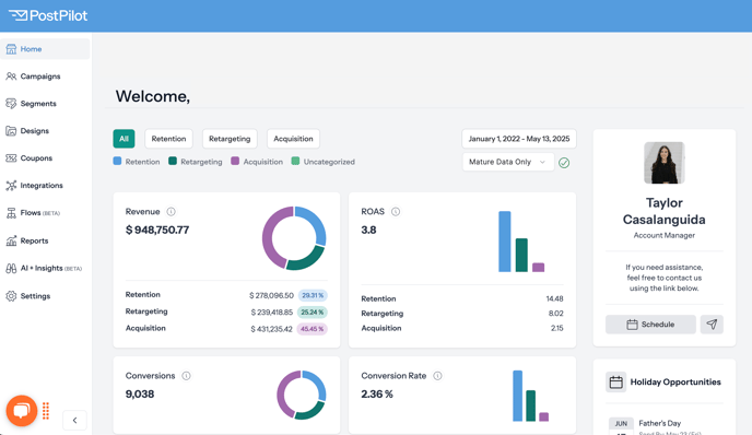
KPI Overview
The KPI Overview shows 8 KPIs across all campaigns, based on chosen filter settings.
In the data below, the default toggle is selected, which shows the performance of all direct mail campaigns going back to your first send. This can be toggled to show retention-only, retargeting-only, and acquisition-only results across various time frames.
In scrolling down, you will see eight KPIs. In the All view as shown, visualizations will appear that show aggregated retention, retargeting, and acquisition performance.
Additionally, you will see breakdowns showing how much of each campaign type you’ve sent (based on volume of mailers). For instance, the brand below has sent 84.83% retention, 7.62% retargeting, and 7.55% acquisition campaigns, all-time.
Within the PostPilot platform, you can find the formulas for each KPI in the tool tips (the “i” bubbles on each tile). All formulas are also shown below:
- Revenue
- Sum of revenue from all campaigns and flows
- ROAS
- Sum of revenue from all campaigns and flows / Sum of spend from all campaigns and flows
- Conversions
- Sum of orders from all campaigns and flows
- Conversion Rate
- (Sum of orders from all campaigns and flows / Sum of all the mail pieces sent from all campaigns and flows) *100
- Cost Per Conversion
- Sum of spent from all campaigns and flows / Sum of orders from all campaigns and flows
- Total Sends
- Sum of all the mail pieces sent from all campaigns and flows
- Total Spend
- Sum of spend from all campaigns and flows
- Average Order Value
- Sum of revenue from all campaigns and flows / Sum of orders from all campaigns and flows
Time Frame:
You can choose a particular time frame to filter this dashboard.
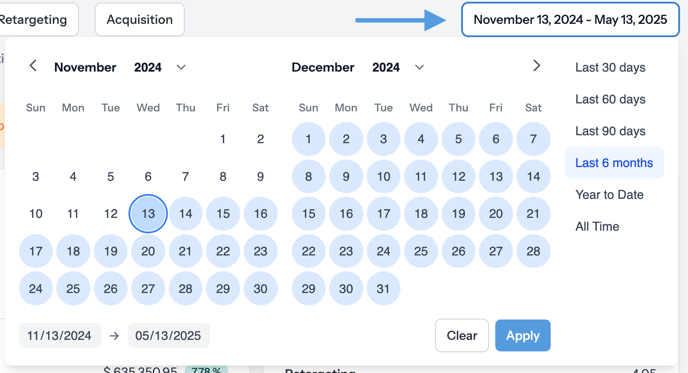
Once you select a particular time frame, you will see the overall data points over that time frame as well as a period-over-period comparison.
For instance, in the example below, “Last 60 Days” is chosen, and the “vs. last period” compares the last 60 days to the previous 60 days.
In other words, if you chose “Last 60 Days” on April 1, you would see (approximately) February and March’s performance, and February/March would be compared to (approximately) December and January.
Data Maturity:
You can also filter data within the chosen data range by Mature Data Only or All Data. Read more about Data Maturity.
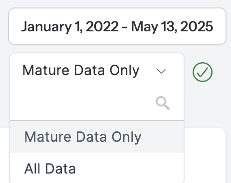
Note: If you adjust the date range to a timeframe that does not have fully baked data, switch the filter to All Data.
Incremental Lift Analysis:
The Incremental Lift Analysis tile displays an analysis of all campaigns with holdouts (that show incremental lift) over the chosen time frame.
- iROAS (incremental return on ad spend): The ROI on spend that can be directly attributed to direct mail and would not be generated otherwise. Excludes non-Shopify revenue.
- iRevenue (incremental revenue): The revenue that can be directly attributed to direct mail and would not be generated otherwise. Excludes non-Shopify revenue.
- Revenue per recipient: Incremental revenue per recipient: The additional revenue that can be attributed to direct mail campaigns, on a per recipient basis.
-
- The $ and % value show the incremental lift between campaigns without and with holdouts.
- Min, Max, Median iROAS: The lowest, highest, and median of iROAS across campaigns.
More on Incremental Results
Incremental results refer to the results of holdout testing.
PostPilot runs holdout tests by randomly excluding an agreed-upon % of customers from a total mailing list. Via live data from our Shopify integration, we dynamically measure the revenue generated over a 60-day period both from customers who did and who did not receive direct mail.
For example, in a 25% holdout, 1 out of 4 customers will not receive direct mail. The incremental results will show whether direct mail was or was not the driver of revenue/ROAS based on who received the mail.
Weighting Data
All metrics on this tile are weighted by send volume to control for the impact of outliers. This means that each campaign is assigned a weight based on the number of cards it has sent.
Example:
Consider a situation of two campaigns with different numbers of mailers:
- Campaign 1: 2000 mailers
- Campaign 2: 10000 mailers
There would be 12,000 total mailers sent.
- Campaign 1 would be weighted at 16% (i.e., 2000/12000)
- Campaign 2 would be weighted at 84% (i.e., 10000/12000).
KPIs and Calculation Details
To arrive at incremental ROAS (iROAS) and incremental revenue (iRevenue), we first calculate incremental revenue per recipient (iRevenue per recipient):
iRevenue per recipient calculation:
- weighted revenue per recipient of campaigns - weighted revenue per recipient of holdouts
Then, we can can calculate iROAS and iRevenue.
iROAS:
- (total mailers sent * weighted incremental revenue per recipient) / total cost for all campaigns
iRevenue:
- total mailers sent * weighted incremental revenue per recipient
Additional Data Points:
- Base Size: The total number of campaigns factoring into the Incremental Lift Analysis.
- Total cards sent: The total of non-holdout test cards sent.
- Total cards held out: The total cards sent to holdout groups.
Downloading Your Incremental Lift Analysis Data
If you would like to download all the data used in the Incremental Lift Analysis, you can do so by clicking the button highlighted below.
AM Tile:
This tile shows your account manager and enables you to schedule a call via a HubSpot link or send them an email.
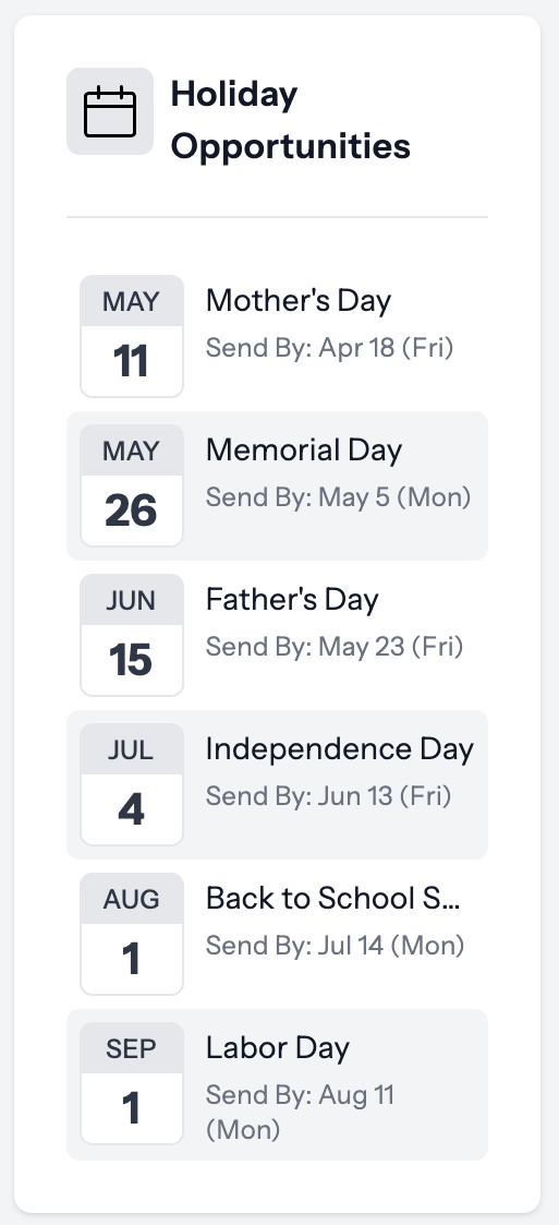
Holiday Opportunities:
Upcoming major holidays in the United States where you can send direct mail. Direct mail usually performs quite well over holidays. This shows upcoming holidays and the due date to send mail in order to get in home for those holidays.
Top Performing Campaigns + Designs
Note on calculations: We generate a score for each campaign or design based on a few metrics (ROAS, revenue, and send volume). We do this by first normalizing the ROAS, Revenue and Send Volume numbers, then multiplying those numbers by a specific weight. Once we have the score for each design, we rank all the designs by the score to get the top performers. same for campaigns.
The Top Performing Across all Campaigns report shows your top individual campaigns (i.e., targeting a particular segment or set of parameters).
Two campaign names below are hidden for privacy in the image below.
Top Creatives Report
The Top Creatives report shows your top performing mailers.
Creatives are are hidden for privacy in the image below.
Top creative is determined at the postcard level, identifying the most successful postcard designs used across multiple campaigns.